
The use of chatbots has become increasingly prevalent, offering businesses and websites an interactive way to engage with users. However, one common challenge that might arise when integrating chatbots into mobile websites is the issue of proper display. Despite being embedded using widgets or HTML scripts, chatbots often appear excessively small on mobile browsers, making it difficult for users to read and interact with them effectively. In this article, we’ll explore this problem in detail and provide a simple solution to ensure that CustomGPT.ai displays optimally on mobile devices.
The Challenge: Chatbots Lost in Small Screens
Visiting a website on your mobile phone, eager to interact with a chatbot, only to find that its messages are barely legible due to their tiny size, is a frustrating experience. This common occurrence highlights the importance of optimizing chatbots for mobile display. Even if the chatbot is fully functional and capable of providing valuable assistance, its effectiveness is greatly diminished if users struggle to read its messages.
The Root of the Problem: Lack of Viewport Configuration
The primary reason behind the miniature display of chatbots on mobile browsers lies in the absence of proper viewport configuration. Without specific instructions on how the browser should scale and display the content, it defaults to rendering it at a standard size, often resulting in content being displayed too small for comfortable viewing.
CustomGPT.ai Solution: Adding Viewport Meta Tag
To address this issue and ensure that CustomGPT.ai displays optimally on mobile devices, we need to add a viewport meta tag to the HTML code of the webpage where the chatbot is embedded. This meta tag instructs the browser to adjust the viewport width to match the device’s screen width, enabling the content to scale appropriately for mobile viewing.
This is how you can do it.
For example, you are adding a CustomGPT.ai chatbot to your website using an embed widget. You need to copy the provided HTML script as shown below.

Just add the viewport meta tag in the header section of the above HTML script and add it to your website page where you want your chatbot to appear then load it in your mobile browser to see the results.
Viewport meta tag:
“<meta name=”viewport” content=”width=device-width, user-scalable=yes”>”
Let’s see how Chatbot was displayed before and after adding the meta tag in the embed widget script.
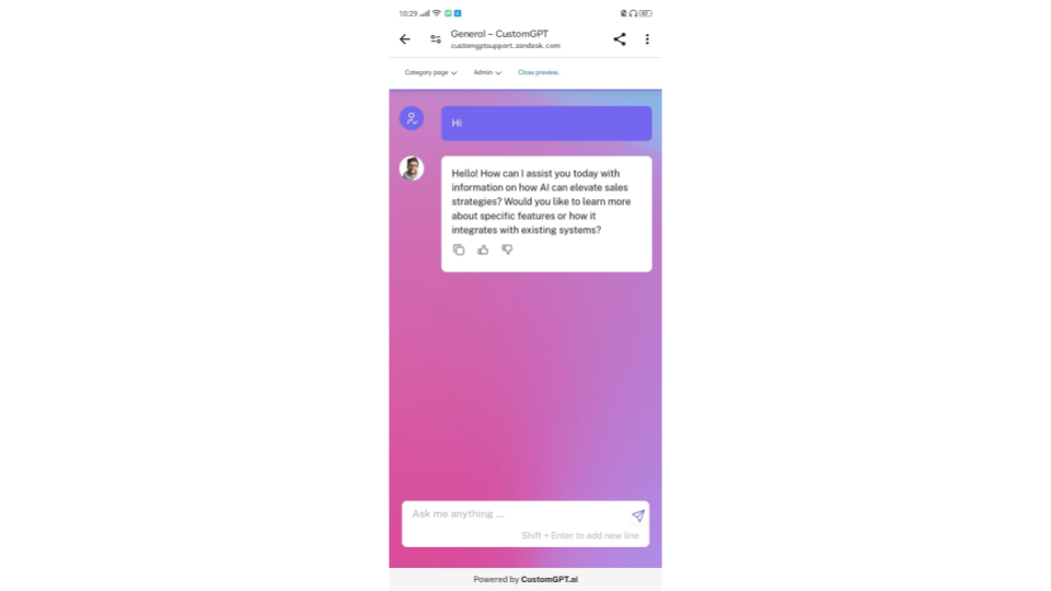
Before
After
By adding the viewport meta tag within the <head> section of the HTML code, we instruct the browser to adapt the content’s width to match the device’s screen width. This ensures that the CustomGPT.ai chatbot displays properly on mobile browsers, providing users with a seamless and enjoyable experience.
Conclusion
Incorporating chatbots like CustomGPT.ai into mobile websites offers businesses and website owners a valuable tool for engaging with users on the go. However, ensuring that these chatbots display optimally on mobile browsers is essential for delivering a positive user experience. By adding a simple viewport meta tag to the HTML code, we can overcome the challenge of miniature chatbot display and provide users with a clear and readable interface.
Frequently Asked Questions
Why does my chatbot look tiny on mobile when it looks normal on desktop?
GPT Legal has handled 19,000+ queries for 5,000+ monthly visitors. If your chatbot looks normal on desktop but tiny on mobile, the most likely cause is a missing viewport meta tag. Without that tag, mobile browsers can render the layout at a wider default width and shrink everything down, which makes chat text and buttons hard to read.
Does the viewport fix work on both iPhone and Android?
Yes. The viewport meta tag addresses how mobile browsers scale the page, so it is meant to help across common smartphone browsers rather than only one device brand. Add inside the so the browser uses the device width when rendering the chatbot.
Do I need CSS media queries, or is the viewport meta tag enough?
Dan Mowinski said, “The tool I recommended was something I learned through 100 school and used at my job about two and a half years ago. It was CustomGPT.ai! That’s experience. It’s not just knowing what’s new. It’s remembering what works.” For a chatbot that appears too small on mobile, the documented fix is the viewport meta tag. The provided source does not require CSS media queries to solve this scaling problem.
Can I fix mobile readability by changing font size or message color?
Not usually. If the whole chatbot is shrinking on mobile, the issue is browser scaling, not just text styling. The documented fix is to add the viewport meta tag so the page renders at the device width. Font size and color can improve appearance after that, but they are not the main fix for a chatbot that appears excessively small.
Where should I place the viewport meta tag so the chat displays correctly?
Dr. Michael Levin of Levin Lab said, “Omg finally, I can retire! A high-school student made this chat-bot trained on our papers and presentations”. For mobile display, the viewport meta tag should go in the HTML section. The browser reads that tag before laying out the page, which is why putting it in the head is the recommended implementation.
How can I tell whether the problem is missing viewport settings or a CSS conflict?
The clearest sign of missing viewport settings is that the chatbot appears excessively small on a mobile browser, because the primary cause identified here is lack of proper viewport configuration. Add the viewport meta tag in the and test again on a phone. If the display returns to a normal readable size, the issue was viewport configuration. The provided source does not include a deeper CSS conflict checklist beyond that fix.